
Mecca Bingo Redesign.
Rank Group, the owners of Mecca Bingo, brought me on to redesign their bingo club landing pages—and it was easily one of the most fun briefs I’ve worked on. The designs reflect that same energy: fun, inclusive, and safe, with a playful, cheeky twist that brings the Mecca spirit to life.
Read the rebranding case study below.
My Role
Product designer
Year
2024/25
Background
The Rank Group is a leading UK entertainment company known for its casino and bingo brands, including Mecca Bingo. Mecca Bingo is a household name with a strong community focus, offering both in-club and online gaming experiences across the UK.
Mecca Bingo needed a fresh design for their individual club landing pages and general club pages, capturing the warmth, excitement, and community spirit of a Mecca night out. My role was to bring this vision to life, crafting designs that felt a bit cheeky, vibrant, welcoming, and fun.
Get a feel for the fun and energy of Mecca Bingo with their TV advert!
Problem Statement
Mecca Bingo’s club landing pages needed a refresh to better reflect the energy, excitement, and community feel of a Mecca night out. The existing pages felt outdated and didn’t fully capture the warm, fun, and inclusive experience that Mecca is known for. The challenge was to modernise the design, make it more engaging for a new audience, and ensure it still felt familiar and welcoming to existing players—all while keeping things fun, a little cheeky, and unmistakably Mecca.
How might we
How might we create a fresh, engaging design for Mecca Bingo’s club landing pages that captures the fun, inclusivity, and community spirit of a Mecca night out—while appealing to a new audience and staying true to the brand’s playful, cheeky personality?
Mission
To bring the energy, fun, and community spirit of a Mecca Bingo night out into the digital space—creating club landing pages that feel warm, exciting, and inclusive, while keeping things fresh, playful, and unmistakably Mecca.
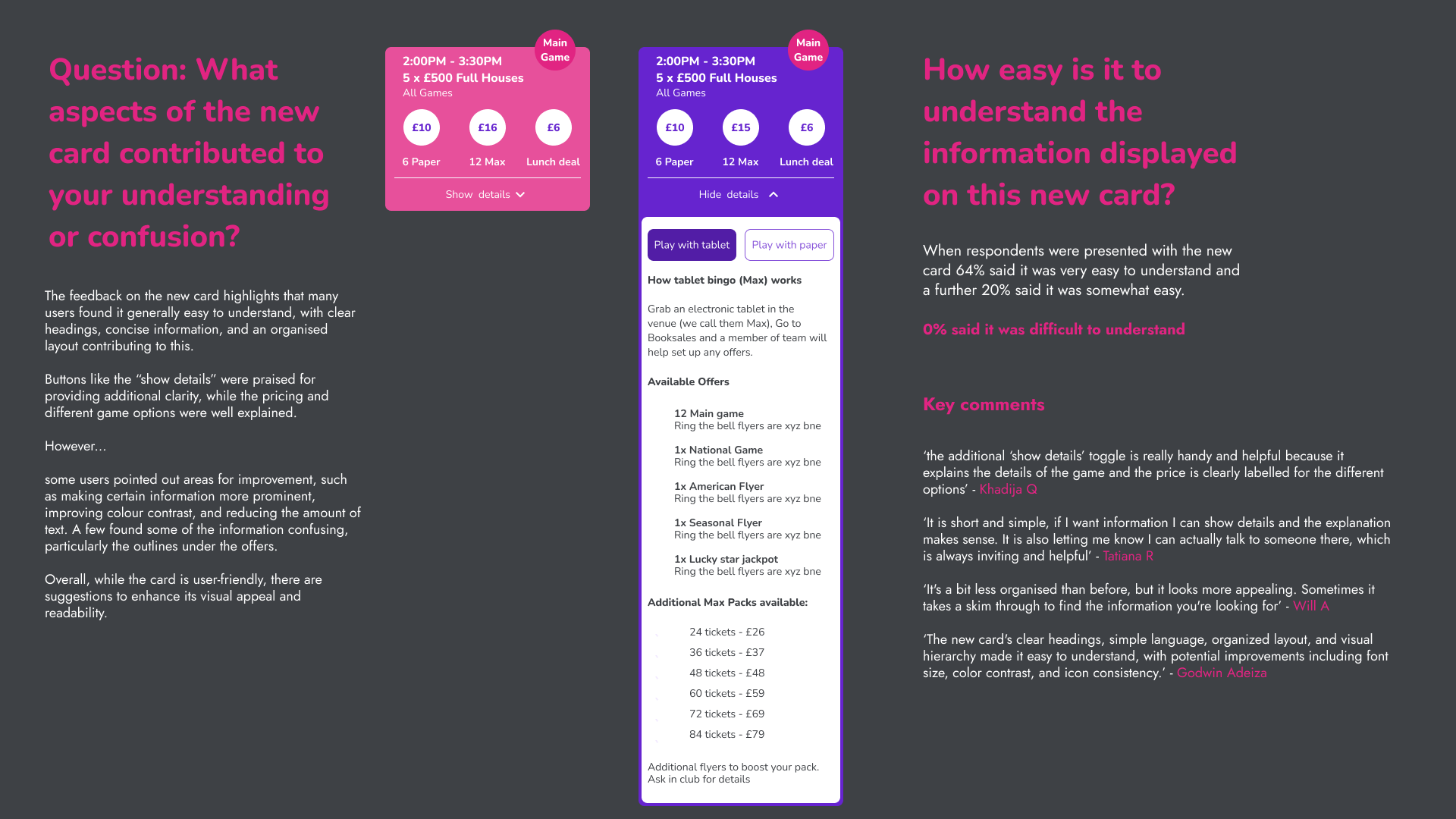
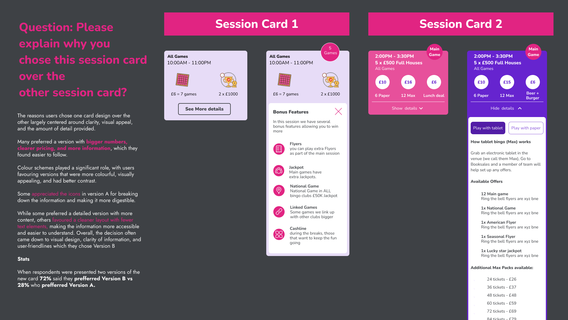
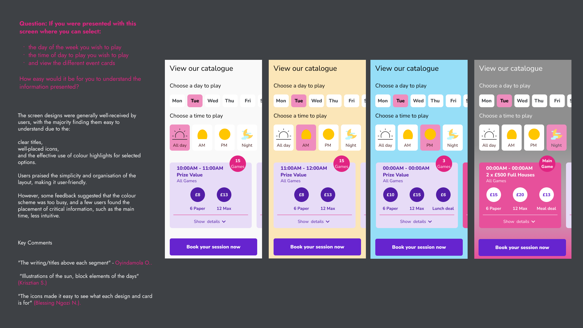
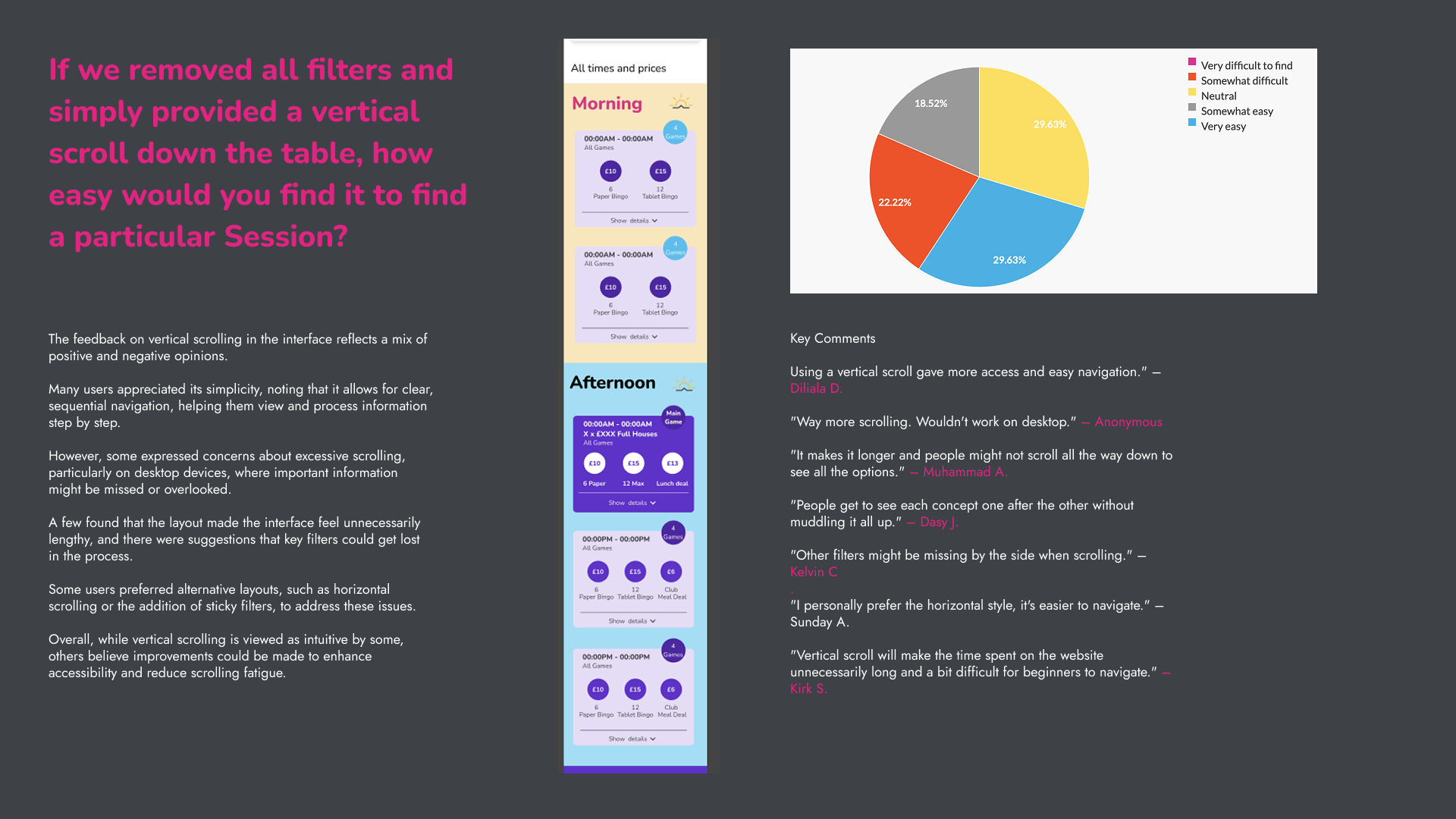
Priority 1. Fixing the bingo times and prices
The Problem
Mecca Bingo’s prize board times and pricing were a mess. User research showed players found it confusing, cluttered, and frustrating, often struggling to figure out session times, ticket prices, and prize breakdowns. It wasn’t clear or intuitive, which meant missed games and a poor user experience—especially for new players.
The Fix
I broke it down, pinpointing where users got stuck, and rebuilt it with clearer layouts, better hierarchy, and a more structured flow. Through prototyping and testing, I designed a system that made session times, prices, and prizes instantly readable. The end result? A simpler, smarter, and more engaging experience that got players excited, not confused.
What already existed
Mecca Bingo’s club landing pages needed a serious refresh. The old design didn’t quite capture the fun, cheeky, and community-driven energy that makes a Mecca night out special. Visually, it felt flat, a little outdated, and lacked the excitement needed to draw users in and get them booking. The layout wasn’t doing the experience justice—key info was buried, CTAs didn’t stand out, and it didn’t feel as warm or inviting as it should. Plus, with Mecca aiming to attract a newer, younger audience, the pages needed a more modern, mobile-friendly feel to keep up with user expectations.
The redesign was all about bringing the Mecca experience to life digitally. That meant bold visuals, a more engaging structure, and a layout that naturally guides users toward booking and exploring their local club. It also needed to be fun, inclusive, and seamless to use, whether someone’s a loyal Mecca fan or checking it out for the first time. The end goal? A fresh, vibrant design that makes people excited to visit—just like a Mecca night out should.


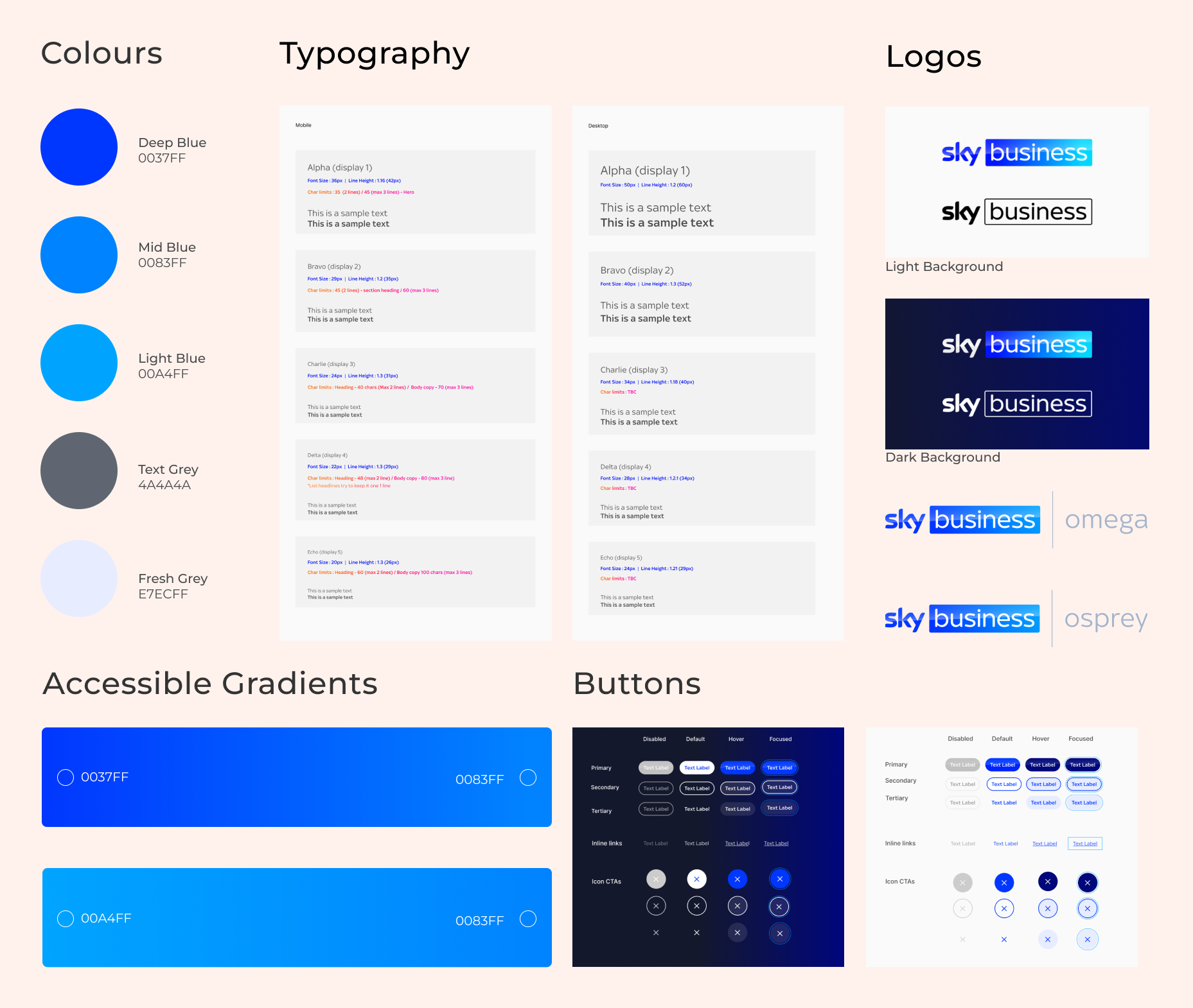
Ensuring Accessibility and brand consistency
Sky is proud to be a member of The Valuable 500, a global business collective consisting of 500 CEOs and their companies working towards disability inclusion.
Sky Business worked with an external design agency who were tasked with supplying a new colour palette, logo and assets based on the audit I carried out.
On testing the new colour palette and logo I found that the palette was not accessible nor was the logo. The graphic displayed below shows the journey of the logo and how we iterated it to ensure it was accessible and consistent with sub Sky brands such as Sky Atlantic, Sky Cinema etc

Design
system foundations
After resolving the accessibility issues and receiving sign-off, I began updating the design system foundations in Figma and Storybook. This step was crucial, as updating the foundations enabled modifications of all other components with the new branding, allowing developers to implement changes across multiple Sky Business websites.
Results
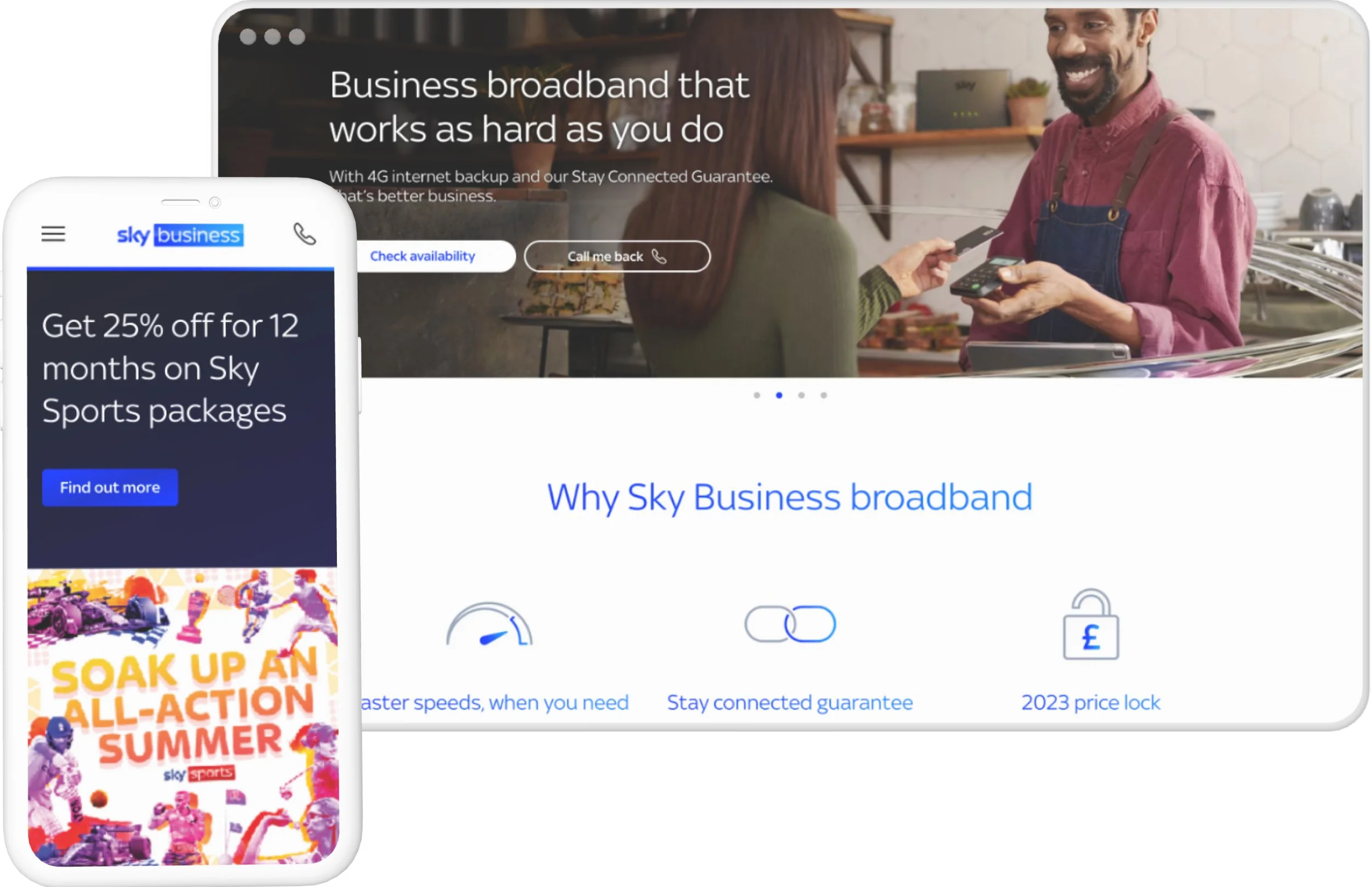
With consistent logo, typography, and color schemes, the landing pages ensured a visually cohesive user experience, reinforcing a unified brand identity.
I was pleased to observe the consistent use of gradients across various websites, as they are a fundamental aspect of the branding. Furthermore, the work I conducted ensured that these gradients are accessible and comply with WCAG guidelines.

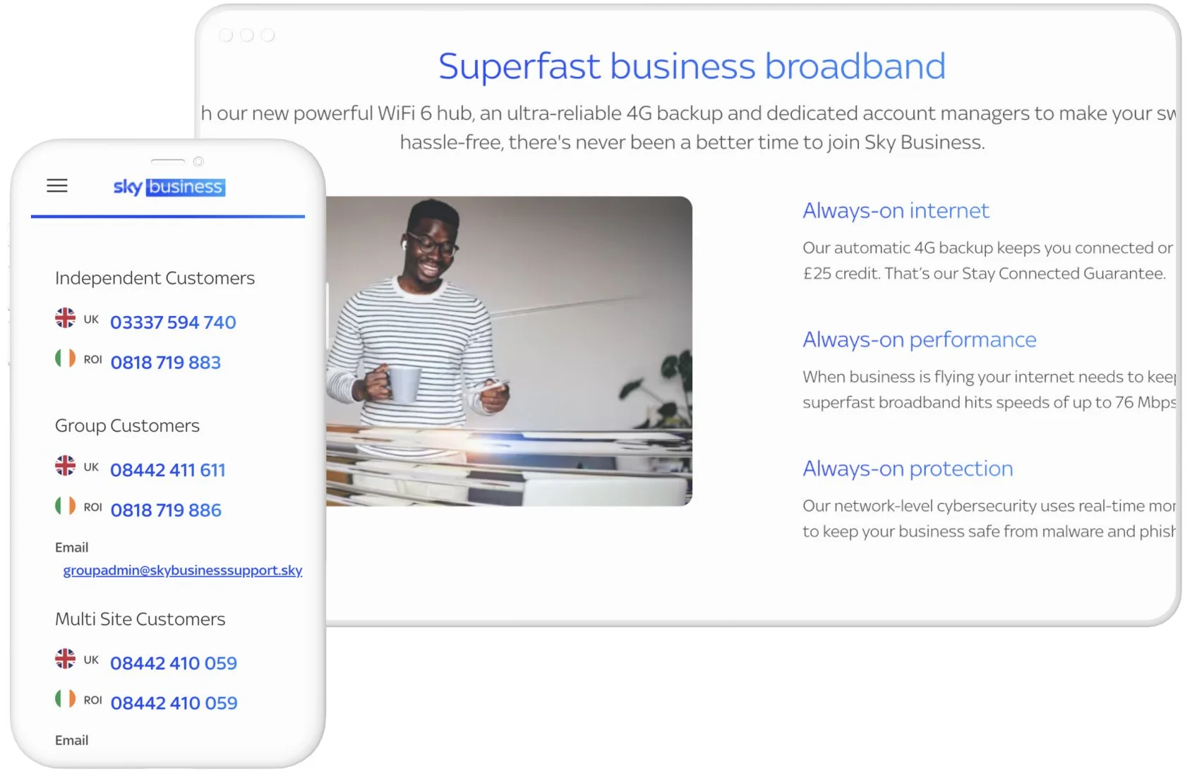
One Help, a self-service online help platform, allows users to find solutions to their issues without the need to call Sky, ultimately saving them time. I was delighted to witness the successful implementation of the new brand guidelines on One Help, which revitalised its appearance and user experience.
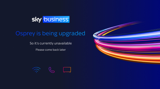
Sky Osprey and Omega
Osprey and Omega are internal CRM sites that are not directly customer-facing, yet they still needed to undergo rebranding. The following examples showcase the holding pages I designed to demonstrate the rebranding of these internal sites.

What was delivered

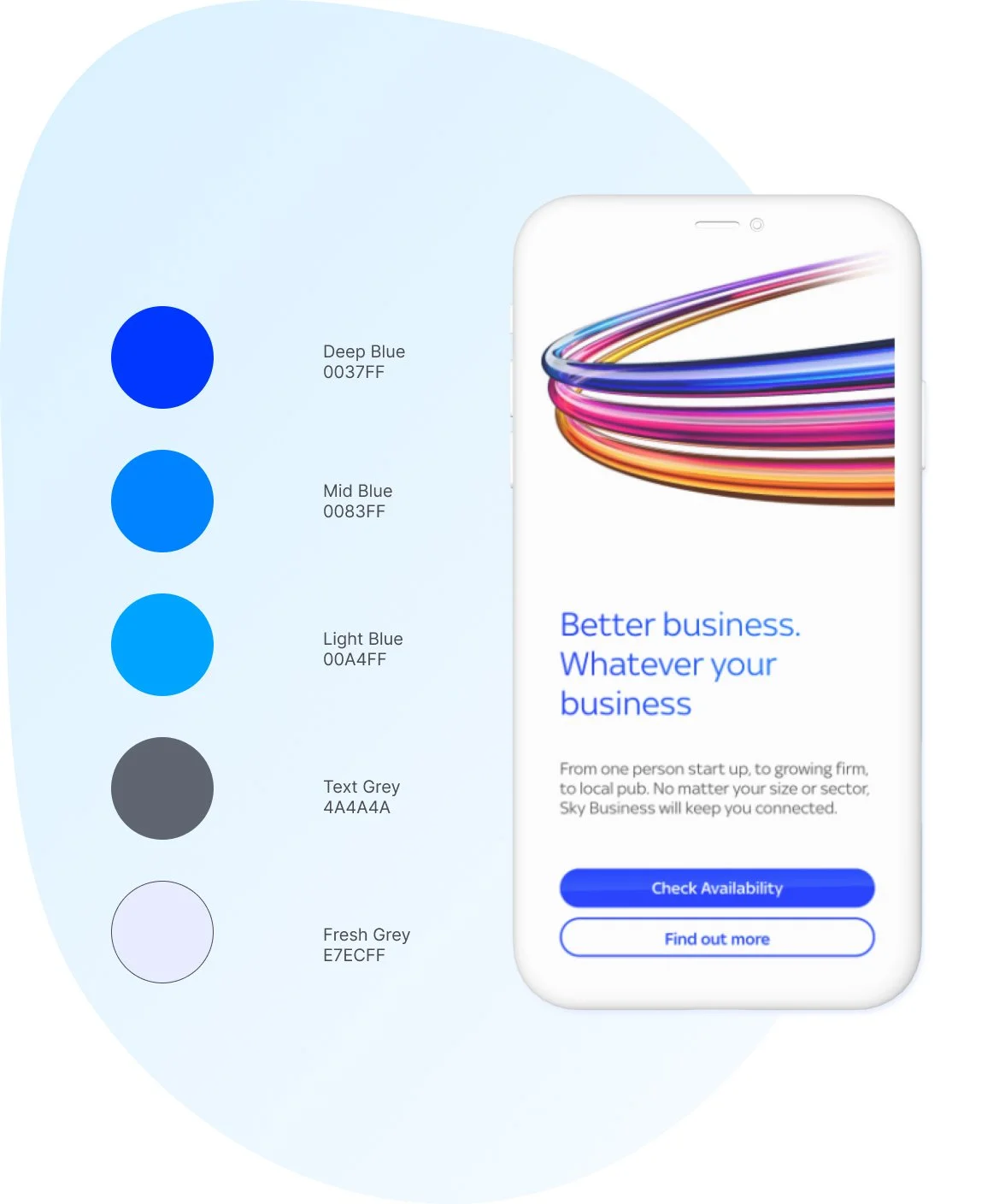
An new vibrant accessible colour palette which reflects Sky Business.

New logos that connects the Sky Digital estate as well as print.

A new button system that improved accessibility and the look and feel.

Better typography with clear tags improving SEO and accessibility.

UI enhancements for internal CRM sites that brings them into the fold.

A fresh vibrant feel to all websites helping relaunch Sky Business.

New assetts that could be used for social media and internal coms.

Updated and improved design system with foundations
and components.
Evaluation
The rebranding project for Sky Business was a triumph! The team collaborated well with the external design agency to create a comprehensive visual identity that effectively competes with other technology providers in the market, while ensuring consistency across multiple websites and user journeys to increase brand awareness. The new visual identity reflects Sky Business's commitment to digital accessibility, which aligns with the company's values and makes it stand out in the industry.
I enjoyed prioritising digital accessibility and inclusivity, making sure the new visual identity met user needs and set Sky Business apart from its competitors. To ensure a smooth transition, the team created a roadmap and allocated resources to the project.
If I could change anything about how I carried out this project I would have made it clear to the agency that accessibility needs to be prioritised and to ensure assets provided meet Web Content Accessibility Guidelines